


Happy National Proofreading Day
Teddy Roosevelt, the Copyeditor, Designer, and Proofreader

Happy March! I’m delighted to coauthor this month’s Strike-Through issue with my sister, Rachel Lane, author of Missing Pieces, a history newsletter, in honor of National Proofreading Day just two days from now on March 8.

Source: Books written by Theodore Roosevelt. 1958 Theodore Roosevelt Centennial Symposium. Dickinson State University. Theodore Roosevelt Digital Library. Dickinson State University.
I (Rachel) will start with looking at Theodore Roosevelt as a man of letters. He wrote over thirty-five books as well as countless magazine articles and letters during his sixty-year lifetime. I will focus in particular on a book TR wrote during World War I, Fear God and Take Your Own Part, before turning it over to Rebekah, who will briefly discuss page design components like typefaces and fonts.
Then—depending on which newsletter to which you subscribe—you’ll get a special section about two women with a direct connection to Fear God and Take Your Own Part in honor of Women’s History Month for Missing Pieces or a more thorough discussion of page design for Strike-Through.
If you don’t already subscribe to both of our newsletters but would like to, check out Missing Pieces (written by Rachel Lane) here and Strike-Through (written by Rebekah Slonim) here.
A Man of Letters
We all know Theodore Roosevelt as a president, a hunter, an explorer, and maybe even a birdwatcher, a coffee drinker, and a fisherman thanks to Missing Pieces. But one aspect of TR that I haven’t really addressed before is his writing.
Throughout his life, TR was reading and writing. As he noted in an 1895 letter to his sister Anna, “I am still working up to my limit; for on the days I spend out here [at Sagamore Hill, his home in Oyster Bay] I am busy with the closing chapters of my book . . .”
Roosevelt wrote over 150,000 letters throughout his life, which works out to 6.8 letters a day, as humanities scholar Clay Jenkinson noted in an article on TR’s literary mastery, and was rumored to read a book a day.
And he was a dedicated author of books and magazine articles throughout an active life and political career. Thanks to the hard work of the staff at the Theodore Roosevelt Center, you can see the extensive list of TR’s writings that are freely available online.
“Theodore Roosevelt was not only a prolific author, but a deeply involved one,” says Dr. William Hansard, a public historian at the Theodore Roosevelt Center. “He worked closely with publishers to design his books. He collaborated with them to choose typefaces, cover and spine designs, frontispieces, even the type of paper and its quality. He took photographs, or had them taken of him, that were either included as is or turned into illustrations by artists such as Frederick Remington. He even took cost into consideration, often assisting in the design of both affordable and luxury editions of his books.”
As one example of TR’s involvement in his books, Augustus Ralph Keller sent Roosevelt, who was then president, three different options for binding of “French crushed Levant in green, red, and blue” in 1902 and asked him to state his preference. (I’m not sure which one TR ultimately chose.)

Many of TR’s books focused on nature, the military, or history—and he was especially prolific during World War I, authoring five books related to that conflict. One of those books was Fear God and Take Your Own Part, a collection of articles originally published in the Metropolitan Magazine in which TR urged his fellow Americans to act on the principles of Americanism inside and outside of the country.
Before the book could get into the hands of the public, however, TR had strong words for the proofreader of his book when TR reviewed the proofs of Fear God and Take Your Own Part.
“To the proofreader: Please have some component man go over the book and strike out the superfluous ‘u’ in every word; and stop the publishing until this is done. I will not have this ridiculous spelling attributed to me.”

I assume the proofreader followed TR’s directions because the published version available on Google Books today doesn’t include any unnecessary u’s like in the word “honor.”
Over a hundred years have passed since the publication of Fear God and Take Your Own Part, and good proofreading, copyediting, and developmental editing are still just as essential—especially in this new world of AI.
Rebekah here.
As we have seen, Teddy Roosevelt was very involved in the creation of his books. Writers, thinkers, and leaders who express deep, grand ideas tend to realize that the details that go along with these expression of those ideas—the commas that shape the sentences, the color of the spine and cover of the printed book—help to convey the meaning. Roosevelt and Lincoln are just two examples of politicians deeply invested in the minutiae of books and of language.
Some of the input that Roosevelt offered was more on the copyediting side, some on the design side, and some on the proofreading side.
A quick refresher on the difference between copyediting and proofreading, as people are sometimes confused about it. A simple way to remember and understand the distinction is that copyediting occurs before typesetting, and proofreading occurs afterward.
The Manuscript at the Copyediting Stage
The manuscript hasn’t yet been turned into a book at the copyediting stage. The book is in the final stages—no extensive rewriting is allowable at this stage—and it has chapter titles and section headings in place. But it doesn’t yet have a typeface (more on typefaces later), or running heads, or page numbers, or the other features that we associate with a published book. The copyeditor will make hundreds if not thousands of small changes to the notes and bibliography section to bring it into conformity with The Chicago Manual of Style (CMOS), and she will also make hundreds if not thousands of revisions to punctuation choices and wording choices, in the name of clarity, consistency, readability, and the dictates of house style or Chicago style. In modern-day publishing, at this point the book-to-be is a Word document that you scroll through.
Roosevelt’s instruction to delete superfluous u’s falls within the realm of copyediting. Although Roosevelt gave the directive at the proofreading stage, that’s really something that should have been fixed earlier, as it would necessitate many changes. Sometimes, global (i.e., manuscript-wide) issues like that aren’t caught until the proofreading stage, but it isn’t ideal, because the page numbers have now been set, and extensive changes can mean the page numbers need to be reflowed—an expensive fix.
The Manuscript at the Design Stage
After copyedits are completed, a designer typesets the book, which then gets sent to a proofreader.
Decisions about paper quality, trim size (the dimensions of a page), and number of illustrations are often made before copyedits, but the design stage is where those specifications are enacted.
Roosevelt choosing which color of French crushed levant he wanted to use for the binding of his book falls within the realm of design. (According to Merriam-Webster, “crushed levant” is “a smooth-surfaced strong flexible leather obtained by crushing a coarse-grained goatskin.”)
The Manuscript at the Proofreading Stage
At the proofreading stage, the book is a PDF of what the printed-out version will look like. The main job of the proofreader is to check for typos (there are always at least a few!) and to check the pages’ appearance. Are the running heads always in the same font? Are they correct, or has the running head for chapter 1 been placed at the top of all the pages in chapter 2 as well? Are there unnecessary line spaces anywhere? Is the font consistent for Headings 1s and for Headings 2s (e.g., is it always size 14 at the Heading 1 level and small caps for the Heading 2 level)?
Quick note on “typeface” versus “font.” Traditionally, “typeface” means a family of fonts. It’s the more generic term. Debbie Berne explains in “The Design of Books” that “in the days of metal type,” “an author might go to a print shop and say, ‘I’d like my book set in Caslon’” (“The Design of Books: An Explainer for Author, Editors, Agents, and Other Curious Readers” [Chicago: University of Chicago Press, 2024], 43). Caslon is the typeface.
But a font is the specifics: the individual member of the family. Berne’s explanation continues: “The printer might say, ‘. . . I’ve got two fonts: 10 point and 12 point’” (“Design of Books,” 43). Another example: “Times New Roman” is the typeface, but “Times New Roman bold 12” is the font.
Now the terms are pretty much interchangeable: “In the digital age, the fonts we use are computer files. I don’t have stacked cases of metal type in my office, but thousands of files on my computer. . . . What was a useful difference in terminology has become, in most situations, irrelevant” (“Design of Books,” 43).

If Roosevelt looked through the page proofs to make sure the typeface/fonts had been applied correctly—and would make sense if he did, because he chose them—that would fall within the realm of proofreading.
The Basic Structure of a Page
When Roosevelt looked through those individual pages, what did he see on each page? In honor of National Proofreading Day, let’s look closely at an individual page since the focus of proofreading is largely on how the pages look and if all the elements are correct.
We’ve all seen thousands and thousands of pages, and even if we don’t know the terms for the parts on them, we know that pages in printed books have a similar format, usually containing the following elements:
Page numbers (every page)
Running heads (every page)
Chapter title (some pages)
Subheading (some pages)
Line break / ornament (some pages)
And, of course, the text itself (every page)
Let’s use as our sample a page from Theodore Roosevelt: Preaching from the Bully Pulpit by Benjamin J. Wetzel. (I recommend it for a great overview of TR’s religious views and spirituality!)

First notice the page number. CMOS says that the “page number . . . is most commonly found at the top of the page, flush left verso [verso is left-hand page], flush right recto [recto is right-hand page]” (1.6). This book follows the most common way to format a page number.
Second, the running head. Running heads are variable in their content. According to CMOS 1.12,

For this book, the running head on the verso is the book title minus the subtitle (so simple Theodore Roosevelt) with the chapter title on the recto. This means it’s deviating a little from the CMOS guidance, which says, “For a book without named chapters or other structural divisions (a novel, for example), the book title can be used for the running head on both verso and recto, or running heads can be omitted.” Using the book title as the running head is most common in the absence of named or numbered chapters.
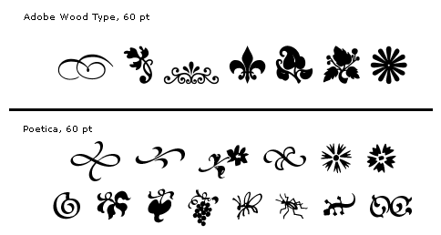
This page is in the middle of a chapter, and the book itself doesn’t have any subheads. But it does have ornaments, which are the line of asterisks near the bottom of the page. What’s the point of ornaments—or their alternative form, a blank line?
CMOS clarifies their important function: “Where a break stronger than a paragraph but not as strong as a subhead is required, a set of asterisks or a type ornament, or simply a blank line, may be inserted between paragraphs” (1.58).
The blank space, the set of asterisks, or the type ornament is a visual clue that the author is switching gears.

These are type ornaments. Source: Wikipedia
Copyediting and proofreading might seem tedious to some. Is your job really checking for typos in running heads?! But Teddy Roosevelt knew that it mattered if the typeface was correct—and which color the binding was. Even though he advocated for a strenuous life of excitement, the man who hunted big game, traversed wild landscapes, and gave stirring speeches from his bully pulpit could sit down to the quiet, simple work of proofreading and respect its value.
Beating through the heavy thicket of English, chased by running heads,
Rebekah Slonim
I always learn something from your newsletter. The difference between typeface and font was particularly helpful. Regarding ornaments, if one doesn’t use an asterisk, what is your preferred ornament?