


Copyediting Is Not the End, but What Happens Afterward?
A Enthusiastic Recommendation of Debbie Berne’s “The Design of Books”

Today I’m going to take you “under the hood,” as it were, with a real-life copyediting story that will segue into an explanation of why both copyeditors and readers alike should know more about book design, which happens after copyedits are completed.
[Copyediting and book design] both are essential aspects that allow books to communicate meaning.
—Debbie Berne, book designer
Recently, I was copyediting a hefty academic work for a university press. The author’s subheadings were very long, often as long as a title for a journal article. And like journal article titles, they often had subtitles. Think something like “‘Till This Moment I Never Knew Myself’: Elizabeth Bennet’s Development of Self-Knowledge while Reading Mr. Darcy’s Letter.” (That’s a fictional title; the book was not about Jane Austen.) And remember—these subheadings are introducing sections within a chapter. They often took up the whole line on the page in the Word document, and even sometimes part of a second line. (I usually copyedit manuscripts in Microsoft Word.)
In my judgment, the subheadings were too long. They felt distracting—instead of signposts to briefly signal where the chapter was headed, they became the main event on the page. The reader would get bogged down trying to figure out what the next section was about.
And The Chicago Manual of Style says that “subheads within a chapter should be short and meaningful and, like chapter titles, parallel in structure and tone” (1.55).
I gave the author suggestions on how to trim many of the subheads considerably, and she incorporated the changes and made some of her own revisions. Both the author and I were satisfied with the shorter, trimmed subheads as the manuscript headed into the next step in the production process.
A few weeks later, I received the latest book in the inimitable Chicago Guides to Writing, Editing, and Publishing (CGWEP) series in the mail. I love these books, published by the University of Chicago Press. They give me insights about my niche in the publishing world (some of the books in the series focus, in whole or in part, on copyediting) while also teaching me about other related or less-related aspects of writing, editing, and publishing. I discovered the series about two years ago and have been gradually buying books from it ever since. I plan to read through and own the whole series at some point.
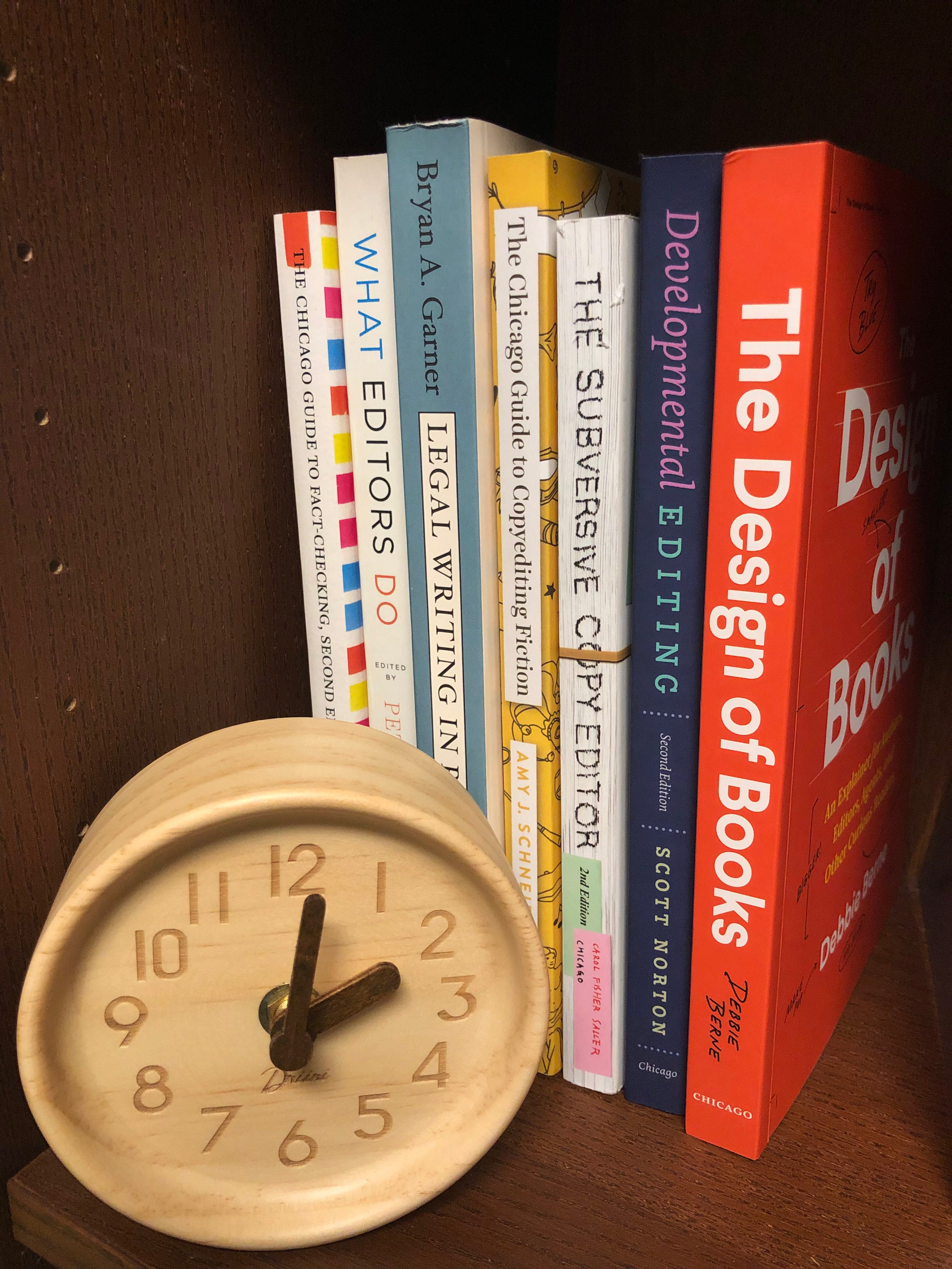
My current collection of CGWEP books: a small portion of the titles in the series. Speaking of book design, look at those beautiful covers and spines!
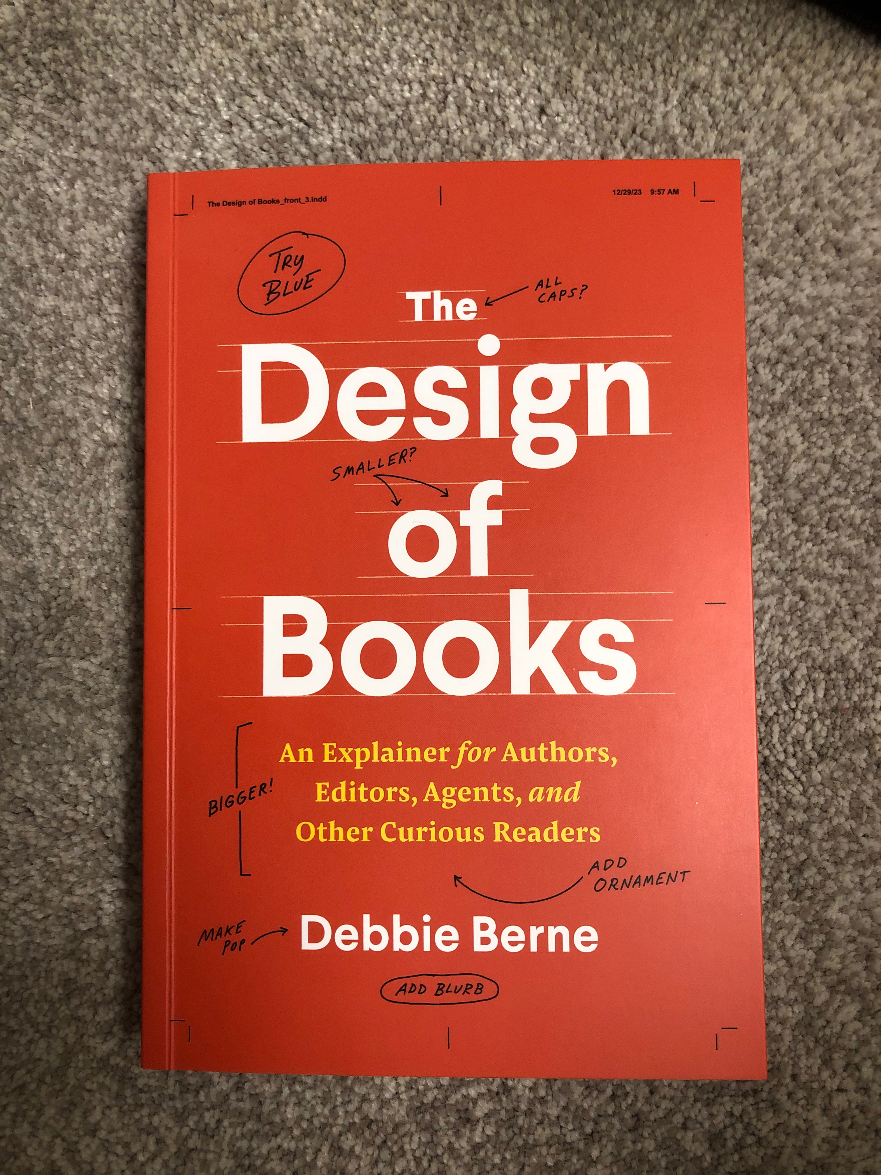
The most recent book in the series is called The Design of Books by Debbie Berne. It intrigued me because I only know about a small portion of the publishing process. An author has often been working on a book for years before I ever see it. The author’s contact with the publisher—with the editor who acquired the manuscript and decided to publish it, and with many other publishing company employees—may date back months and months. At most I have a manuscript for three, maybe three-and-a-half months: a tiny window in its years-long gestation. Once I worked on a book by an elderly professor who had spent most of her career thoroughly researching the city of Odessa, Ukraine. I realized I was getting a peek into a person’s life work. It reminded me that in my work I’m tinkering with and polishing text that an author has labored and labored over. And that the life of the book-to-be continues once I’m done with it.
After I send a Word document with a copyedited manuscript, crisscrossed with thousands of tracked changes, back to a press, the book gets typeset and formatted and designed.
I know, because as a proofreader I encounter the manuscript once it’s been typeset. A PDF comes my way from a press with pages that have running heads and page numbers and artwork all set in place. It’s no longer a Word document, but an almost-book that needs to be checked for typos before it can be printed.
Of course, I know the Word document I’m working with when copyediting will one day be a physical book that can be held in my hands. Sometimes, presses send me copies of books I’ve worked on, and I always marvel a little to see them “in the flesh.”
But I am guilty, as Berne throughout the book rightly suggests that many are, of forgetting about the manuscript’s ultimate destiny as a printed book or ebook when I’m making copyedits. I’m focused on the granular, making sure the commas are where they should be. I’m focused on the words, making sure they are clear and consistent and readable.
When I objected to the length of the subheads, it wasn’t because I was directly thinking about how they would appear on the printed page in the finished version. I was thinking about their function as signposts, not as long titles. I was on the right track, yet I still wasn’t keeping the designer in mind as I should have.
Berne writes, “My take on subheads: they should be relatively short. The space that is created by a short line is part of what makes it identifiable as a heading. Short heads also allow readers to quickly grasp what they’re about to read. Headings that take a full line length or—ugh—more than a single line will be less effective and should usually be reworked” (The Design of Books: An Explainer for Authors, Editors, Agents, and Other Curious Readers [Chicago: University of Chicago Press, 2024], 114).
The designer doesn’t want to deal with formatting a long, unwieldly subhead. Long subheads just don’t look good. And they’re not helpful to the reader.
The designer’s perspective matters because she’s the one who turns a manuscript into a book: “No one wants to read your Word doc, no matter how beautifully written it is. It’s not a book unless it’s designed to be a book” (Berne, Design of Books, 2).
A book designer turns a bunch of words and punctuation marks into something you can hold and read, choosing the book’s fonts (for the main text, the subheading text, etc.), putting it into type, creating its cover, positioning its running heads, and much more. (I highly recommend reading her book to learn more about what a designer does!)
Berne both wrote and designed the book.
I don’t know which color the subheadings will be when I look at a manuscript in Word or how the title will be formatted on the cover—and my job is to copyedit the manuscript, not design it into a book. Nevertheless, I now plan to ask myself more often, “How will this element of the text need to be dealt with at the design stage?” I hope that asking myself this question will help to make the designer’s job easier and serve the reader better.
I decided to reach out to Berne herself to see what she wants copyeditors to know and keep in mind about design, and she was kind enough to respond:
In many ways, your question is hard to answer in a few sentences, and really I suggest for those interested to read the chapter “Inside the Book,” which speaks to how copyediting and design intersect; what is most relevant for copyeditors to understand. And then I would say:
Copyediting and design are partners. We are both doing our best to ensure that a book is cohesive in structure, hierarchy, order, and even character. And design picks up the details from the copyedit. Our work jumps off yours. Book design is mostly invisible to readers. Copyedit truly is! And yet both are essential aspects that allow books to communicate meaning. The stronger your work (which in many ways says to me: the more consistently and deeply you apply your work), the stronger ours will get to be as well. (Debbie Berne, email message to author, February 23, 2024)
In the future, I will remember that I am partnering with the designer who comes after me.
I will close with a bold plea to you, the reader, to notice those aspects of the text that we, the designer and the copyeditor, have so carefully adjusted and arranged. We have placed the running heads so you may orient yourself; we have punctuated the sentences for readability and clarity. We have done all of this not to interfere with the author’s meaning and message, but to display it. If you notice those elements, we believe you will experience the book more fully and deeply. We know this because that’s how we experience books: while richly immersed in their manifold details.
Stirring up the heavy dough of the English language in manuscripts, excitedly waiting for the designer to turn them into pies,
Rebekah Slonim
P.S. Stay tuned for more thoughts on book design in another upcoming collaboration with Missing Pieces and for my husband Daniel’s guest piece to close out my series on Jane Austen.
P.P.S. Berne says, “I absolutely love the spines of books . . . , and I adore designing them” (Design of Books, 94). If you want the chance to “design”—or at least pick the colors for—lots of miniature spines and cases (“the hard cover of a hardcover book” [Berne, Design of Books, 13]), print off this free coloring page from the New York Public Library called Cats in the Stacks. I used these markers, which come in many lovely colors. They are not kid-friendly because they are alcohol-based and bleed through the papers. You could also let your kid use some crayons to color her own version of Cats in the Stacks (I’ve mentioned before the value of teaching the parts of a book to kids—this could be a good way to teach what the spine and case of a book are!)
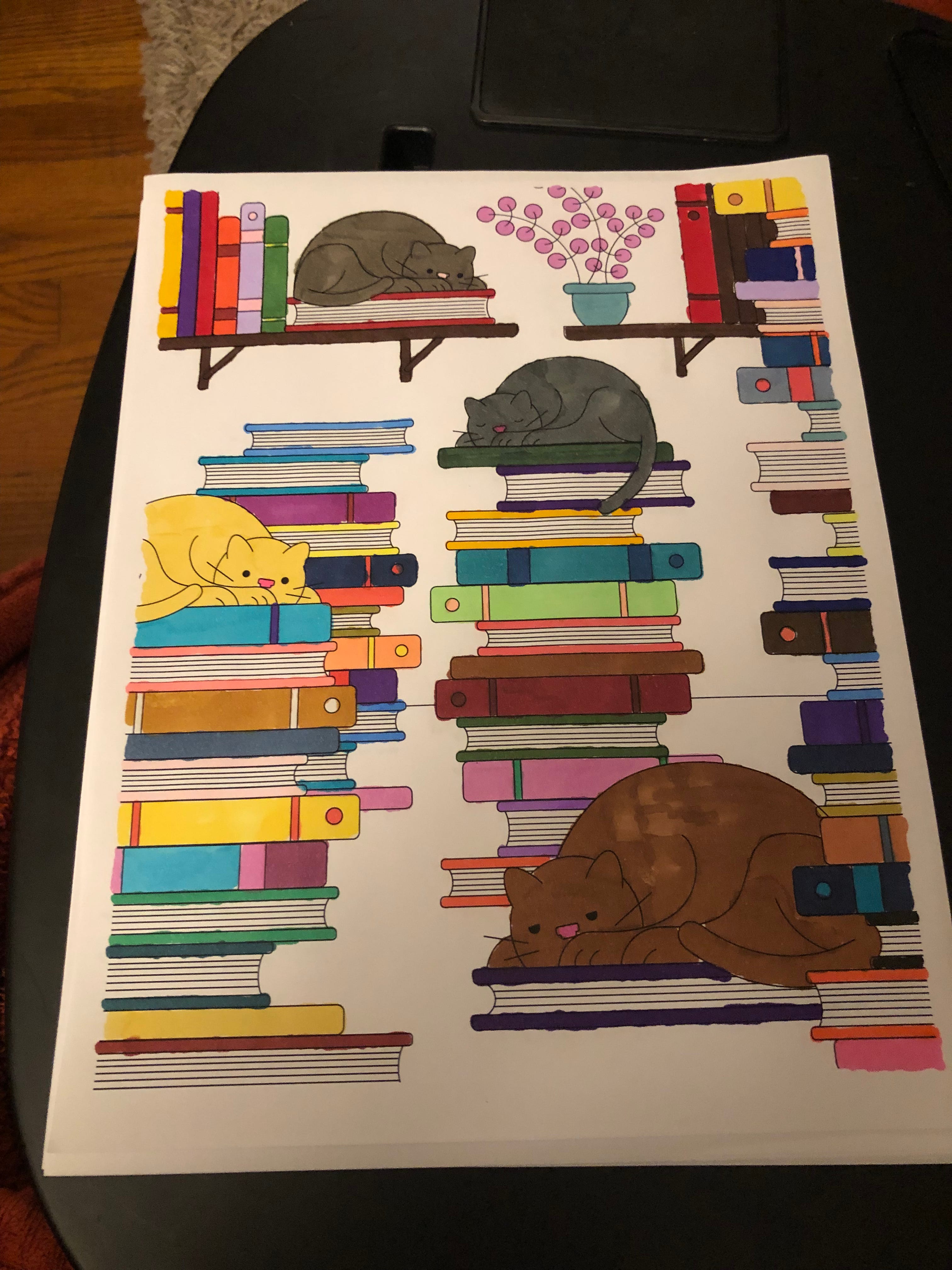
My version of Cats in the Stacks. I enjoyed experimenting with bold colors for the spines and cases.
The NYPL has such fun coloring pages. I love the Cats in Stacks one.